Kemp Management Solutions on Monday announced that it has changed its branding and logo; as part of the rebrand, the company will now go by the name “KMS.”
This move comes in conjunction with the Birmingham firm’s new corporate office purchase and relocation. Additionally, the announcement comes ahead of the firm’s 10-year anniversary in February.
KMS is a program management and consulting firm dedicated to helping clients navigate the nuances of a commercial construction project or large program.
A release stressed that while the company’s website might look different now, nothing will change for their clients, partners or team members.
Mike Kemp, CEO of KMS, said in a statement, “We’ve been fortunate as a small business to work with some of the biggest entities in our region over the last 10 years. We have gained their trust, and we are committed to continuing to provide our services with integrity. This rebrand represents a milestone for our firm. We are going into our tenth year with a brand and logo that not only matches the level of service and professionalism we aim to provide but also gives us something to grow into for the next ten years and beyond.”
“Going with the name ‘KMS’ has always been my long-term plan. Taking my last name out of the branding signifies that we are building something that’s bigger than just me. We think this gives our team something to rally behind,” he added.
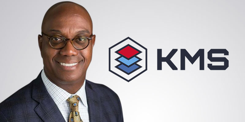
The company’s release explained that the new color scheme and logo communicate what clients can expect from them from the first time they see their brand. The blue hues and the red in the logomark represent confidence and stability grounded in leadership and trust. The outer shape of the logomark represents a finished project as a whole and the idea of the company’s “one contract, one contact and one point of accountability” mantra.
The layers in the logomark represent the smaller projects that make up one larger project. Simple spaced out geometric shapes denote KMS’s organization acumen. Visually, it shows building up, piece by piece, so the smaller projects make up a whole. The typography is strong, chiseled, precise and geometric with a slight techy feel. It shows that KMS is bold, trustworthy, mathematical and tech-savvy, per the company.
Sean Ross is the editor of Yellowhammer News. You can follow him on Twitter @sean_yhn