[tps_header]
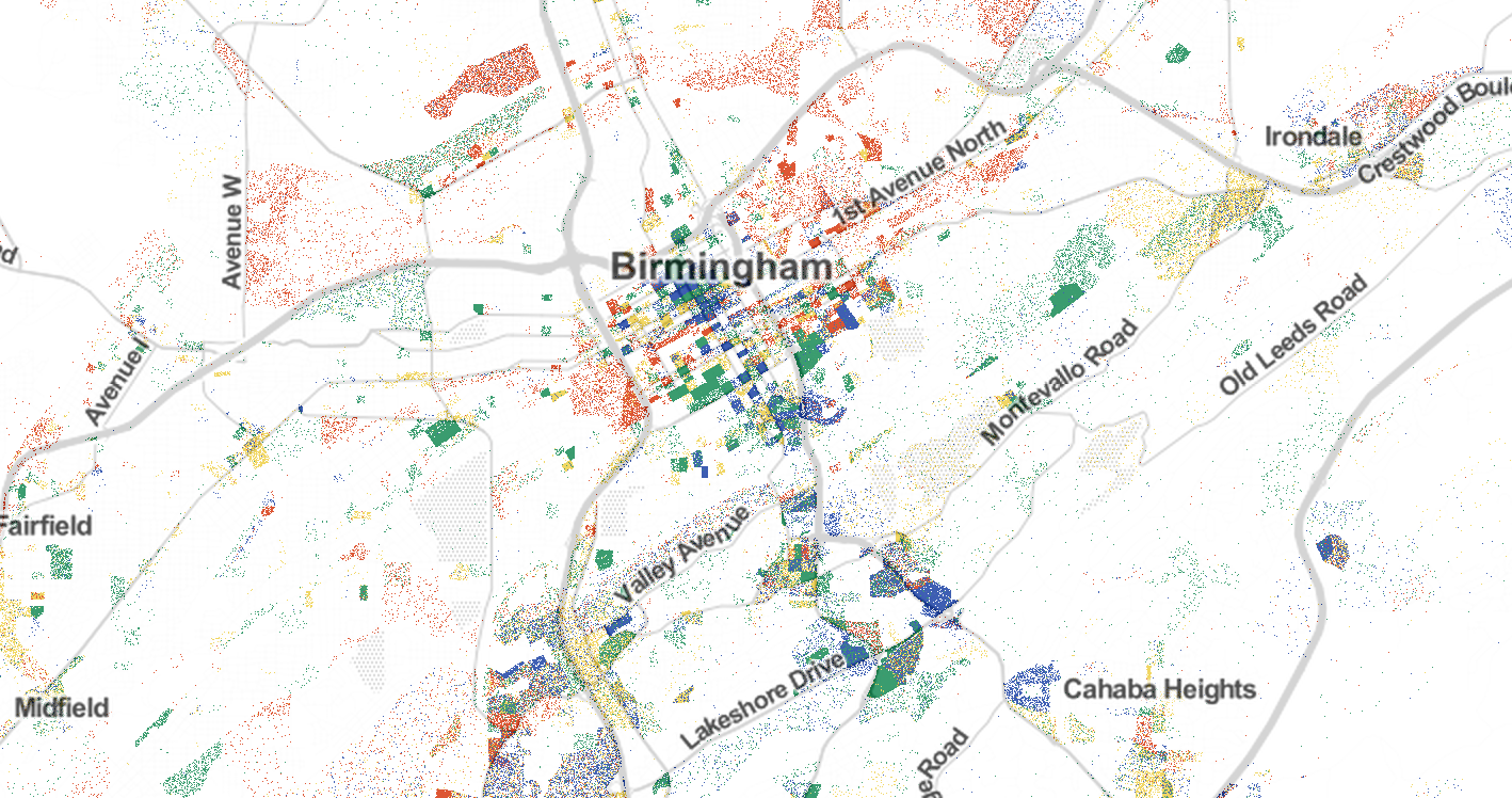
A fascinating new dot map compiled by Robert Manduca, a Harvard sociology PhD student, reveals how cities have distinct regions for different industries.
Manduca created the map using labor data from the 2010 census. “These kinds of maps are great when you’re talking about individuals,” he said, “especially when you’re talking about jobs, because jobs are more concentrated than people. It gets across how tightly packed they are in many U.S. cities.”
A similar 2013 study used different colored points to depict how racial segregation still exists in most American cities.
Here are how jobs in Alabama’s four largest cities are spread out. Click here to see the entire interactive map.
[/tps_header]
[tps_title]Birmingham:[/tps_title]
Red: manufacturing and trade; Blue: professional services; Green: healthcare, education, and government; Yellow; retail, hospitality, and other services.


