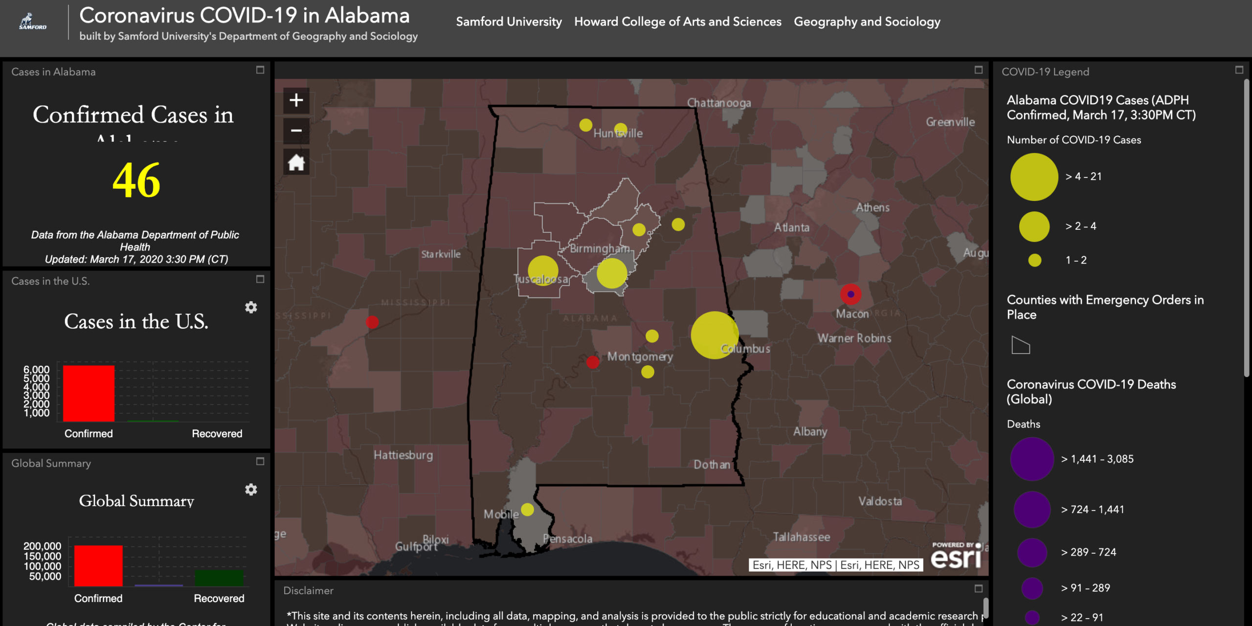
Samford University geography professor Jonathan Fleming has created a dynamic visualization tool to help his students and the public better understand the spread of the coronavirus pandemic.
The project has already garnered some viral attention, receiving over 55,000 visitors online.
The project uses data from the Alabama Department of Public Health, Johns Hopkins University and the Centers for Disease Control.
Citizens can use the tool to check on the spread of the virus not only in Alabama but across the world.
It uses color-coded, scaleable shapes to indicate higher areas of infection.
Jennifer Speights-Binet, chair of the Geography Department at Samford, said in a release that “professors will be using the new resource as a classroom tool in the coming weeks.”
Readers interested in looking for themselves can go here.
Henry Thornton is a staff writer for Yellowhammer News. You can contact him by email: [email protected] or on Twitter @HenryThornton95.